

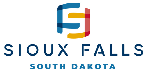
I will first say that I do like it, I think it is festive, and a modern design. But it reminds me more of a mega church logo than something that defines a city and it’s institutions.
To many colors and to bright. As a color blind friend said to me, it is a color scheme nightmare. I would have stuck with two colors like a dark blue and sunflower yellow or black with pinkish red, burnt orange, light green or light blue. Not only does it make it look less ‘busy’ but it saves money in printing and sign making. Not to mention, two color logos are easy to manipulate into one color logos if you need to. It would be almost impossible to convert this logo into something that is one-color, or could be used without gradients with solids, like vinyl lettering on service vehicles.
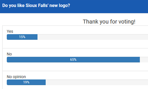
This was the latest results of a survey on ksfykdltnewsnow;

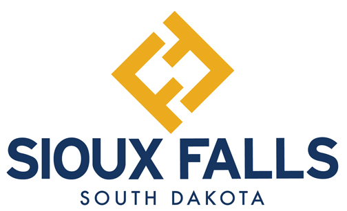
Like I said about the design, I like the festive nature of it, and if this was a church, daycare or hair salon, it would be a great logo. It’s not. The city is something that is institutional, and should not only be strong, but something that stands the test of time. In other words, this logo will look out of date within 4-5 years, and we will have to go through this process all over again. I have designed hundreds of logos over the past twenty years, so I decided to ‘tweak’ this one a bit. I did this in 10 minutes;

As someone said to me today, “Why would you release the new city logo in the middle of a pandemic?” Beats me.